Lajkonik is the undisputed leader of salty bread on the Polish market who have already partnered with us before. The brand is valued for many years of tradition, high quality and iconic taste of its products. Lajkonik draws on tradition but also quickly responds to market trends and has decided to take the next step. Expanding the portfolio with a new product – minimized to a handy format – required crackers packaging design to effectively communicate its main advantages: excellent taste, extraordinary convenience of consumption and unique size.
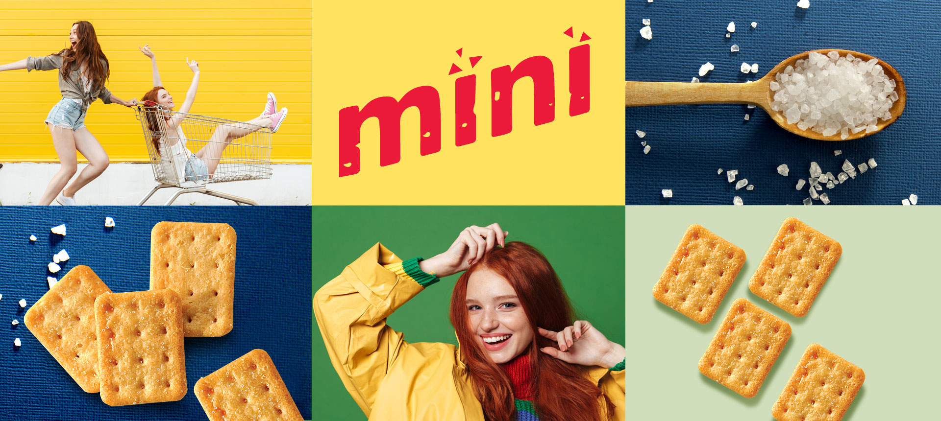
The new subline was supposed to stand out from the competition, be a response to the constantly changing needs of consumers and their search for more „mobile” snacks that could be „immediately” munched. The strategic goal was also to introduce the effect of novelty in the Lajkonik cracker category, as well as to stand out on the very competitive salty bread market.
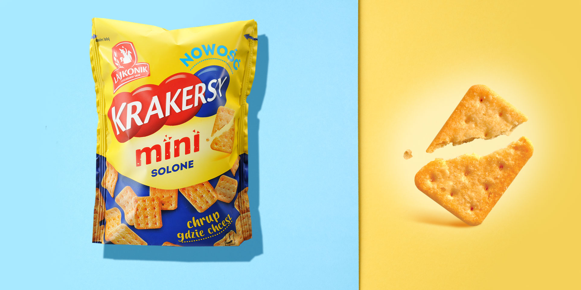
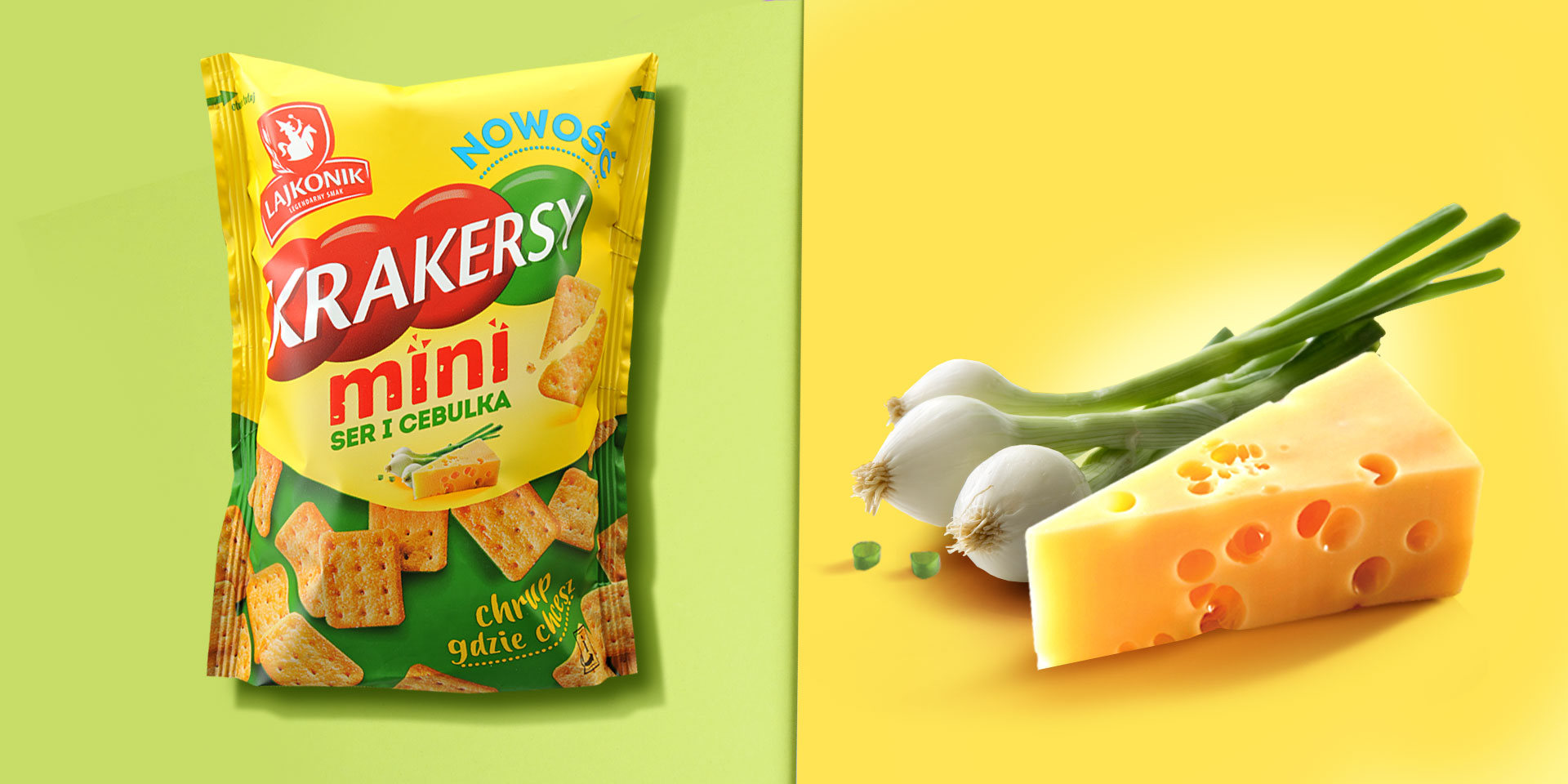
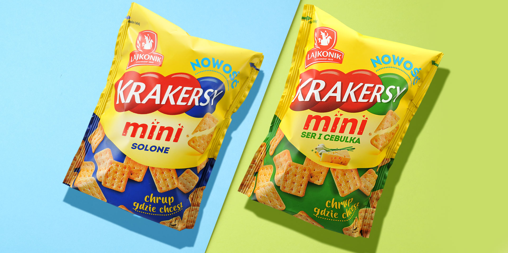
We have designed the packaging which we divided in two parts. The upper, with applied yellow branding color, refers to the classic Lajkonik crackers. In contrast, the fresh and
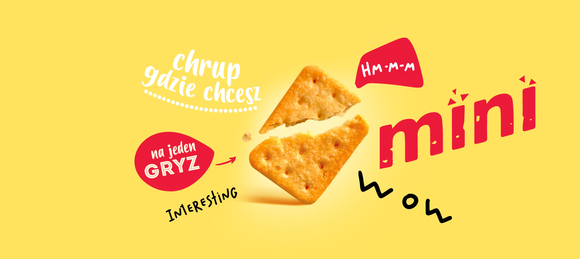
rejuvenated look, in line with the subline’s positioning, is applied to the elements such as characteristic typography, a custom product demo in the form of a broken biscuit or information about new products. In turn, the lower part of the packaging plays a role of a graphic incentive to discover new products. This effect was achieved by symbolically „unveiling” appetizing biscuits. The background color contrasts with the branding color and distinguishes different flavors of crackers. Attractive presentation of biscuits stimulates the senses of the recipient, encouraging them to try the product. The statement „crunching wherever you want” complements the packaging design emphasizing the main advantages – snack’s crunchiness and extraordinary convenience. The name is supplemented with the „mini” addition, corresponding to individual flavors.
