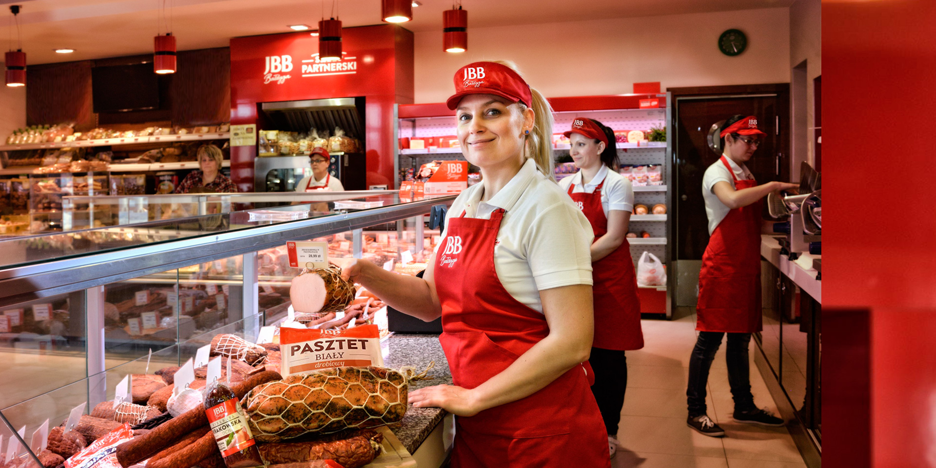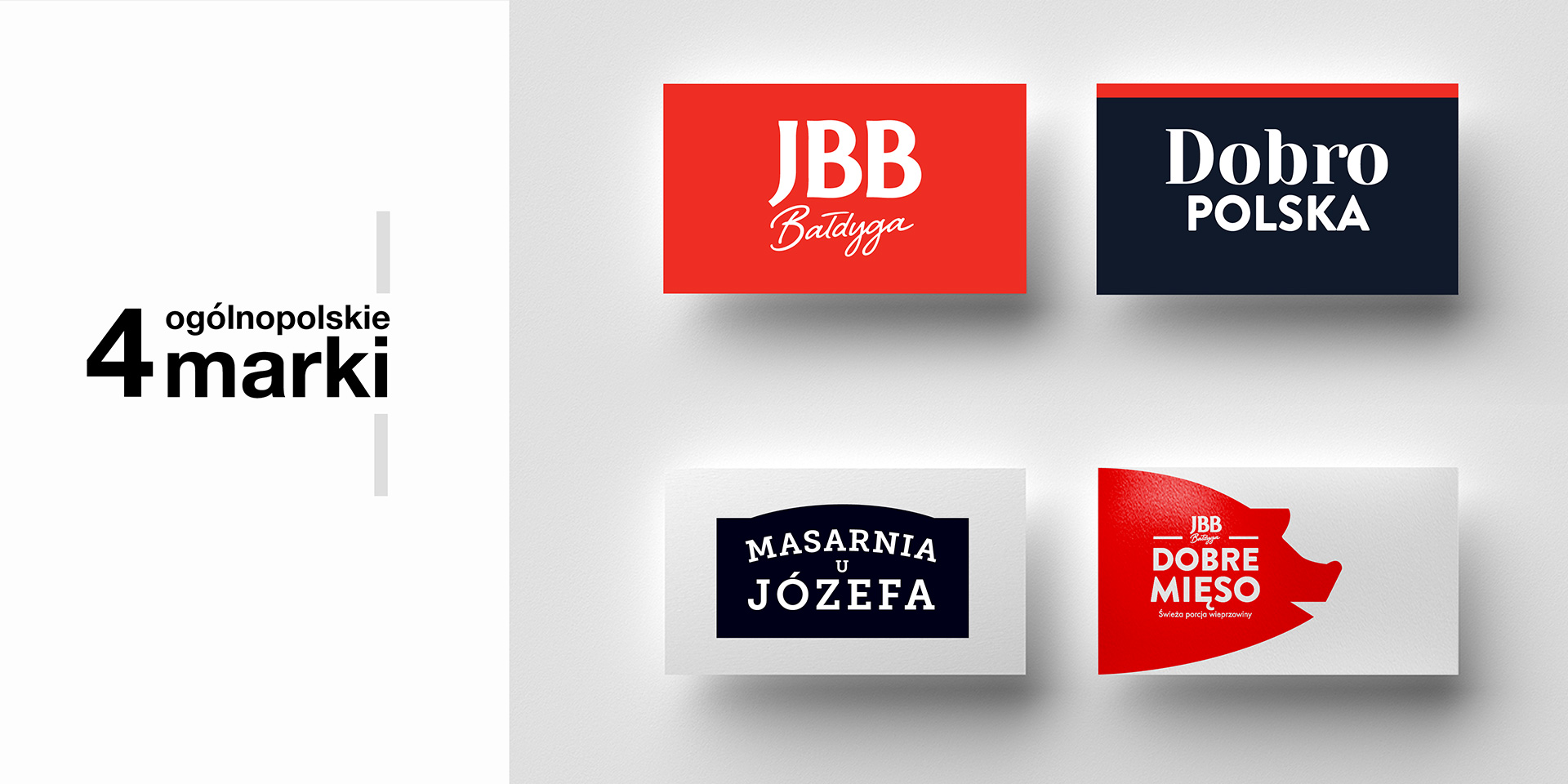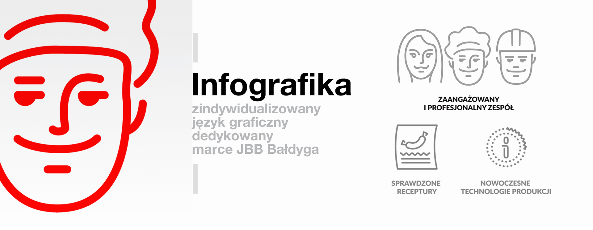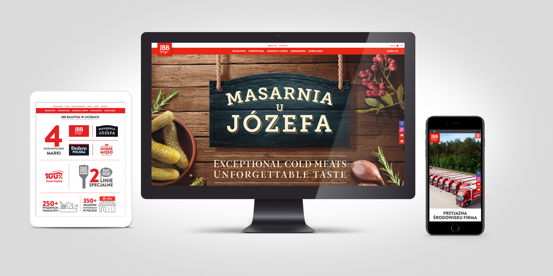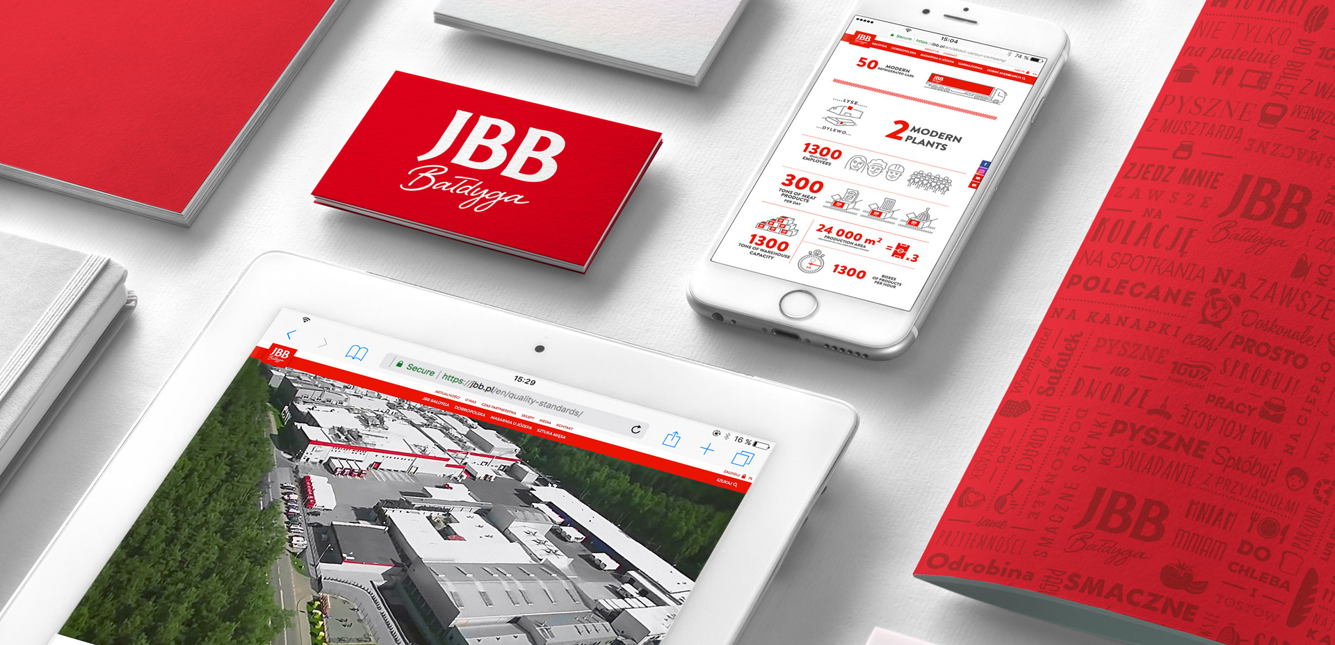
JBB is a family company from the heart of the Kurpie region of Poland. It is also an example of a real „success story”, thanks to the hard work of its owner and commitment to creating one of the largest and most advanced companies in the meat processing industry in Poland. The key values of companies, i.e. family, openness to the consumer and the contemporary nature of the offer, did not find the same differences in existing visual identification. In order for JBB to compete with the biggest players in the market and draw out its local character, we had to give the company a new and clear identity. An identity that fully reflects its position and character.


„We have been working with PND Futura since 2016. The goal of this cooperation was a comprehensive rebranding of the JBB brand, covering areas relating to the corporate identity of the company, as well as holistic packaging brand building. Thanks to the involvement of many specialists, the work is maintained at a high level in various creations and projects, as well as in the comprehensive preparation of projects for printing.”
Piotr Laskowski Sales and Marketing Director
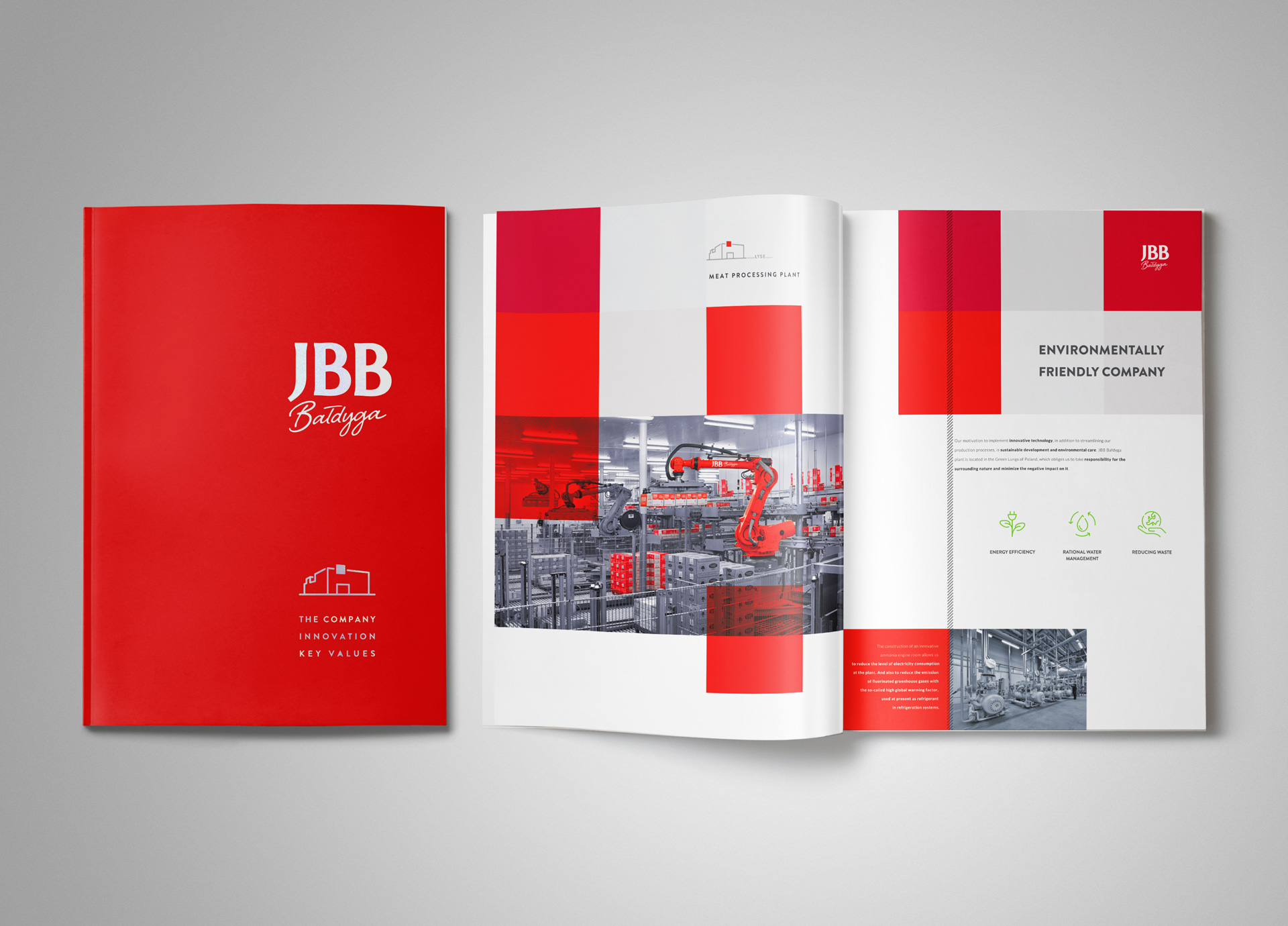
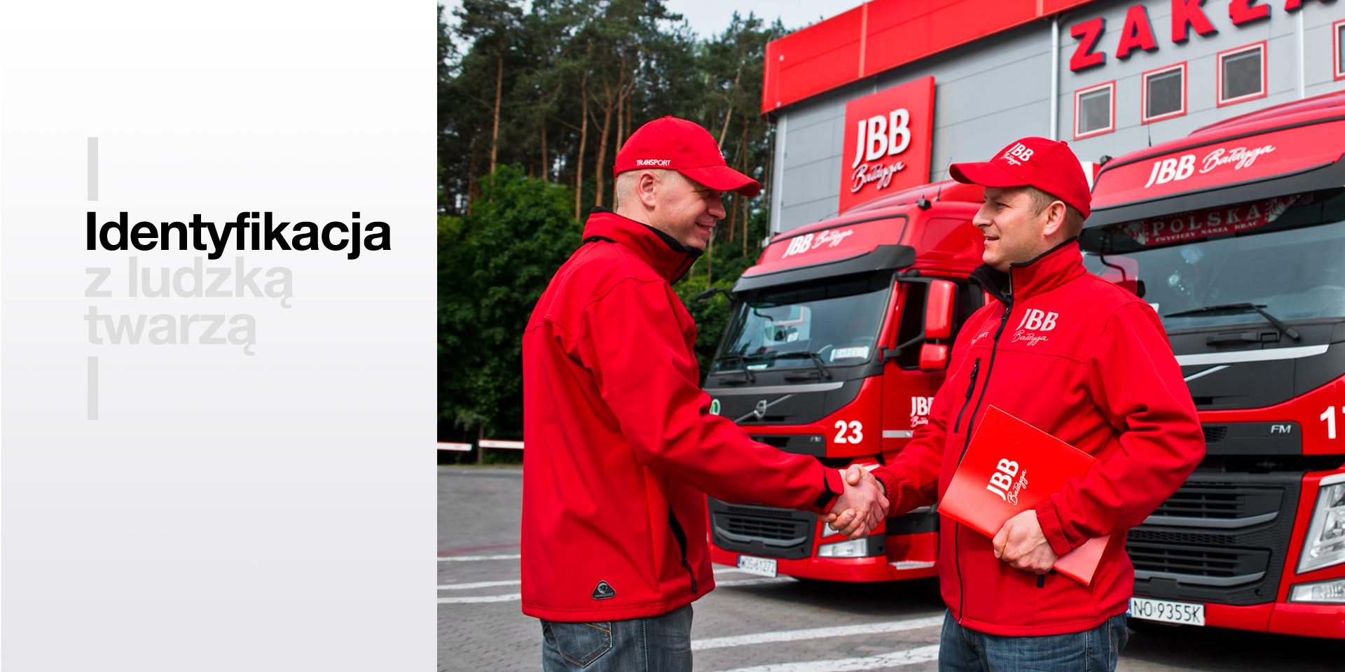
Our analysis of the company’s image had shown that the brand’s problem was its anonymous character and JBB’s title abbreviation – devoid of content and saying nothing to the new customer. What’s worse, its design was embedded in the 90s.
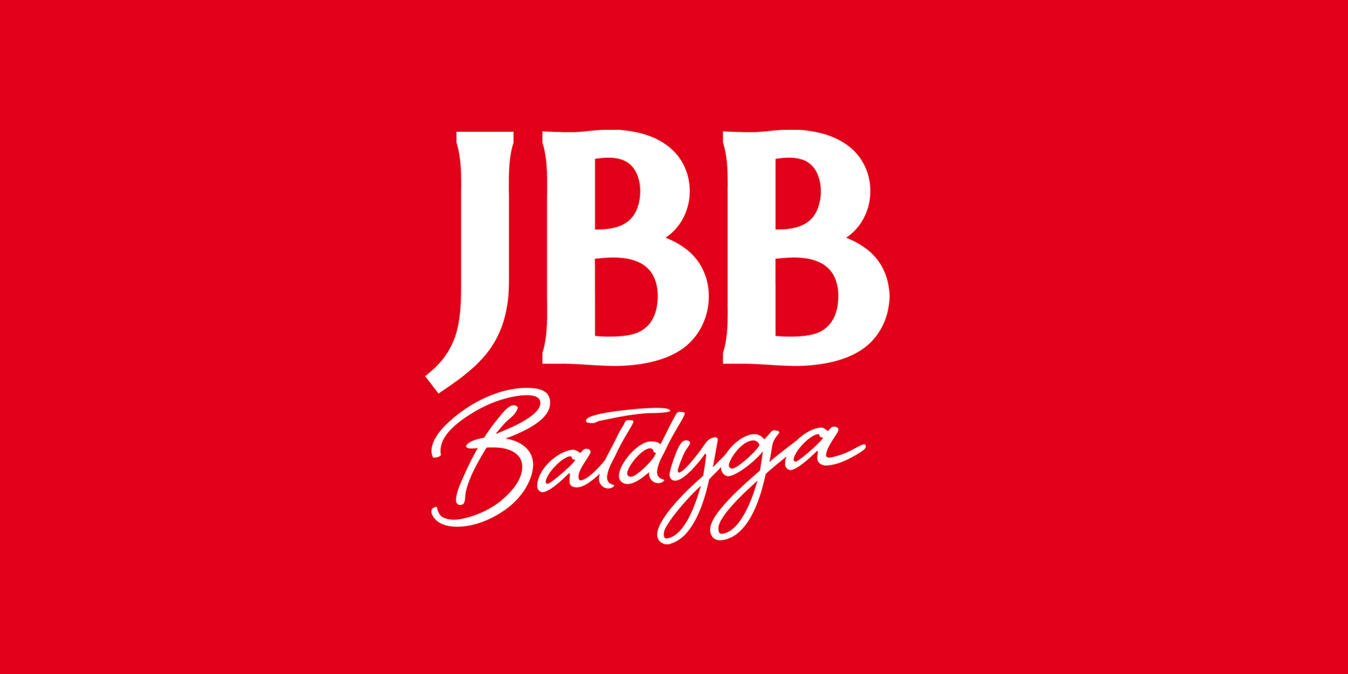
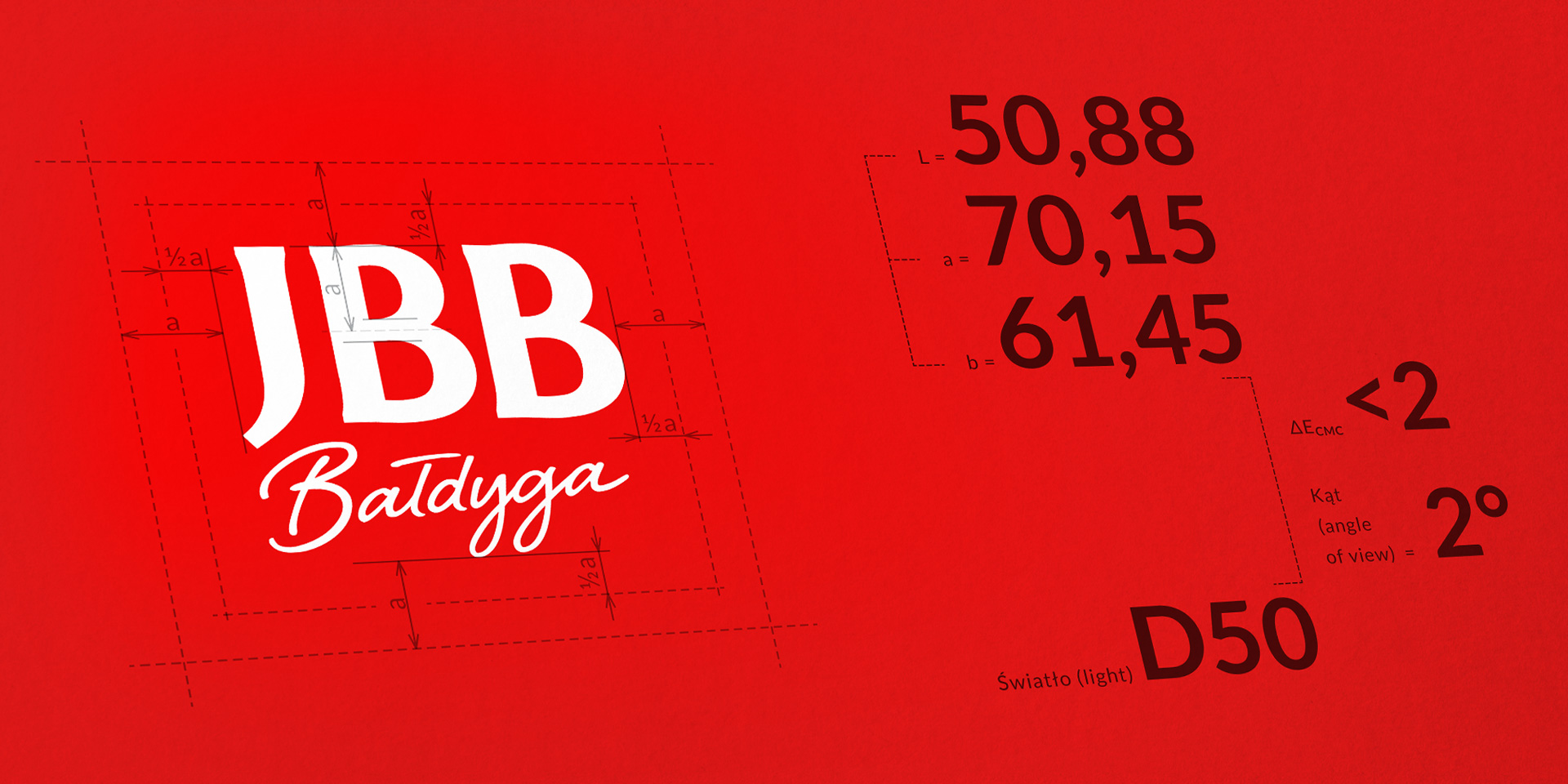
Hence our idea of using the signature of the company owner who uses the name as the certified quality of products. By adding the name „Bałdyga” to the logotype, JBB has become a trustworthy brand with real, authentic people behind it. A family that understands the needs of Polish consumers well.
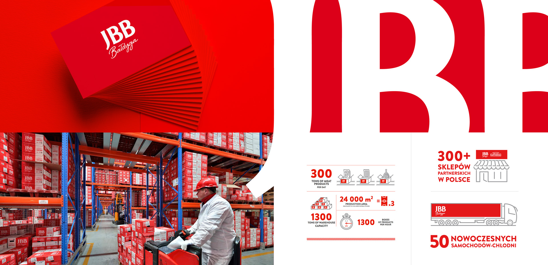
The red and white colors we use provide competitiveness in juxtaposition of competitors and communicate the brand’s character, which in the case of JBB Bałdyga is 100% Polish origin. The entire CI has a simple form, creates an image of a modern manufacturer, and offers simple and safe food products.
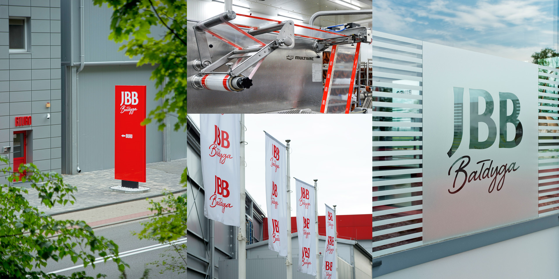
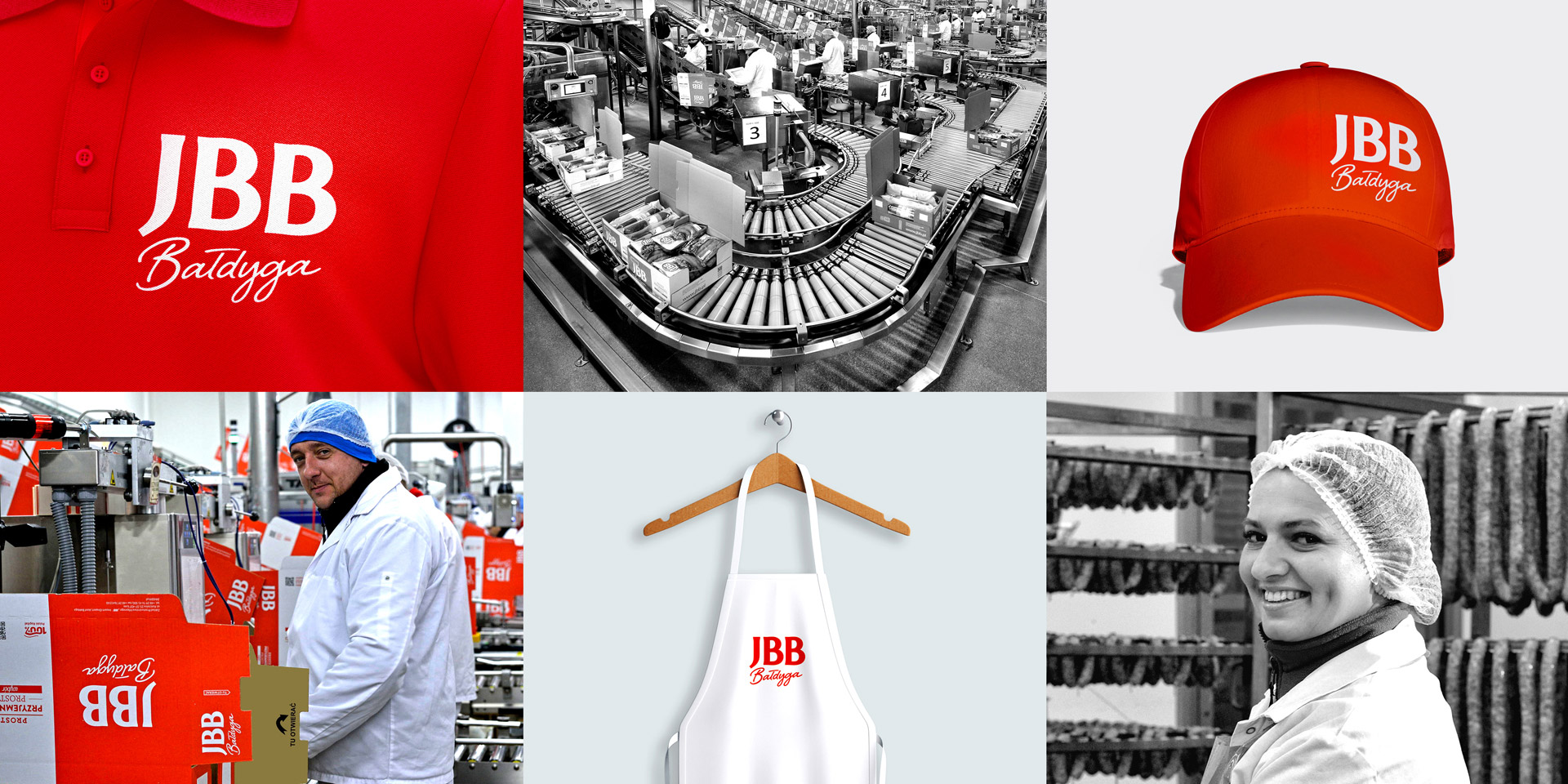
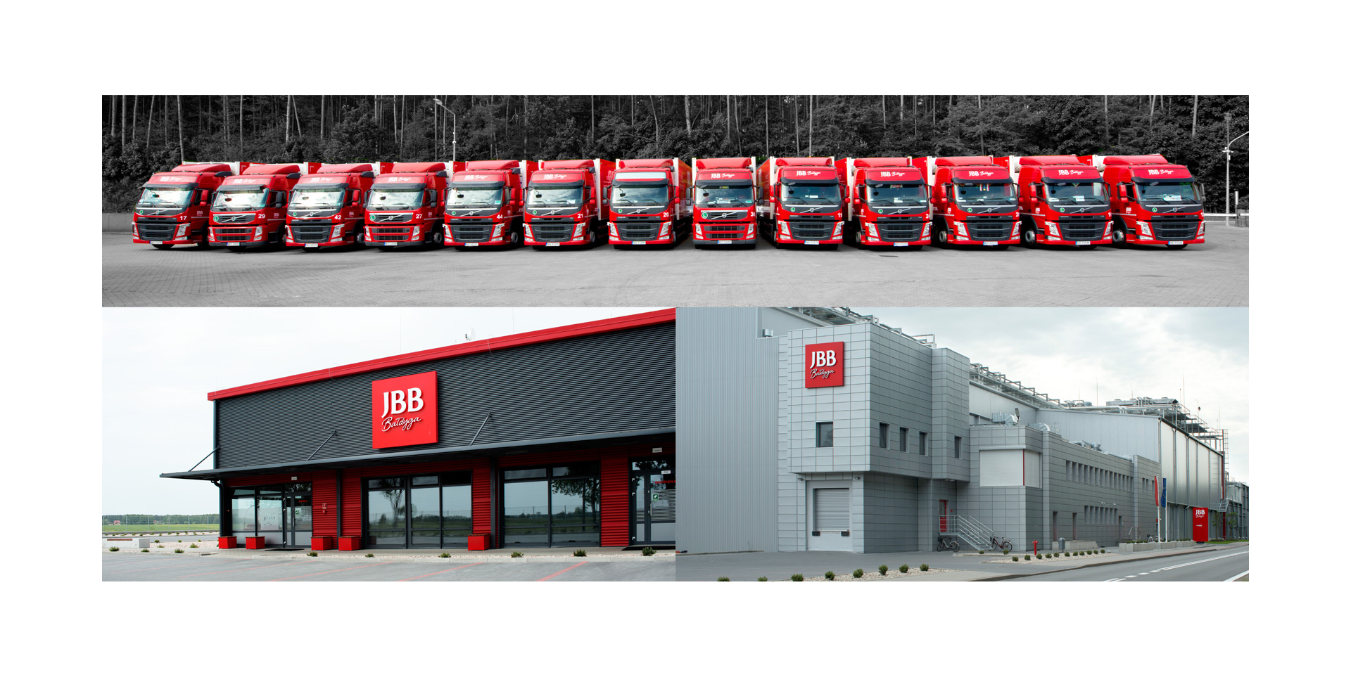
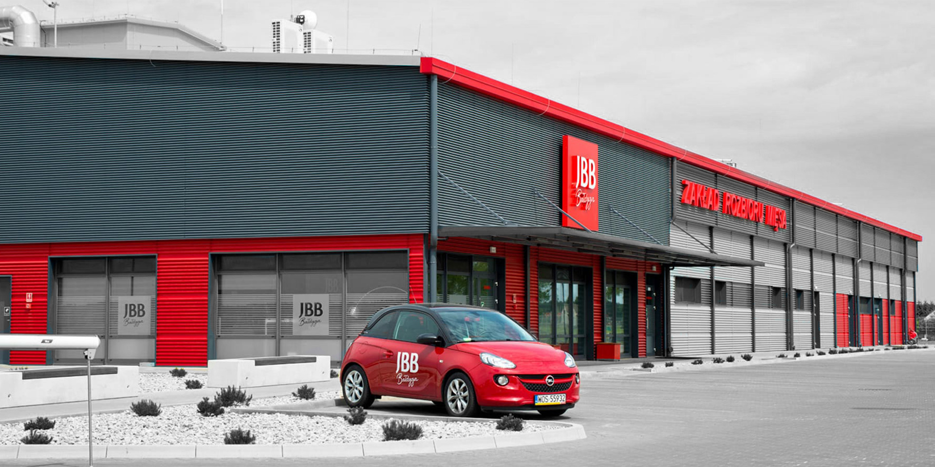
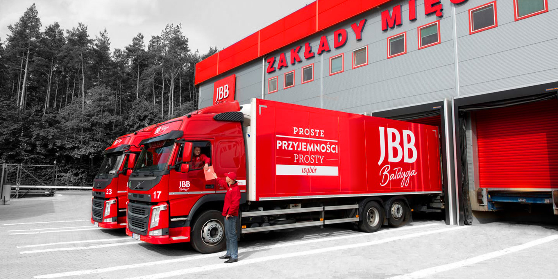
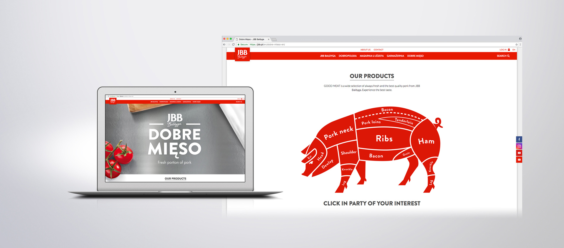
A uniform and coherent identification system has opened JBB Bałdyga’s way to compete with market leaders not only in the traditional channel, but also in new media. Implemented on a wide scale on all devices, in partner stores and in the form of a new website, it was quickly noticed by retailers and appreciated by consumers.
