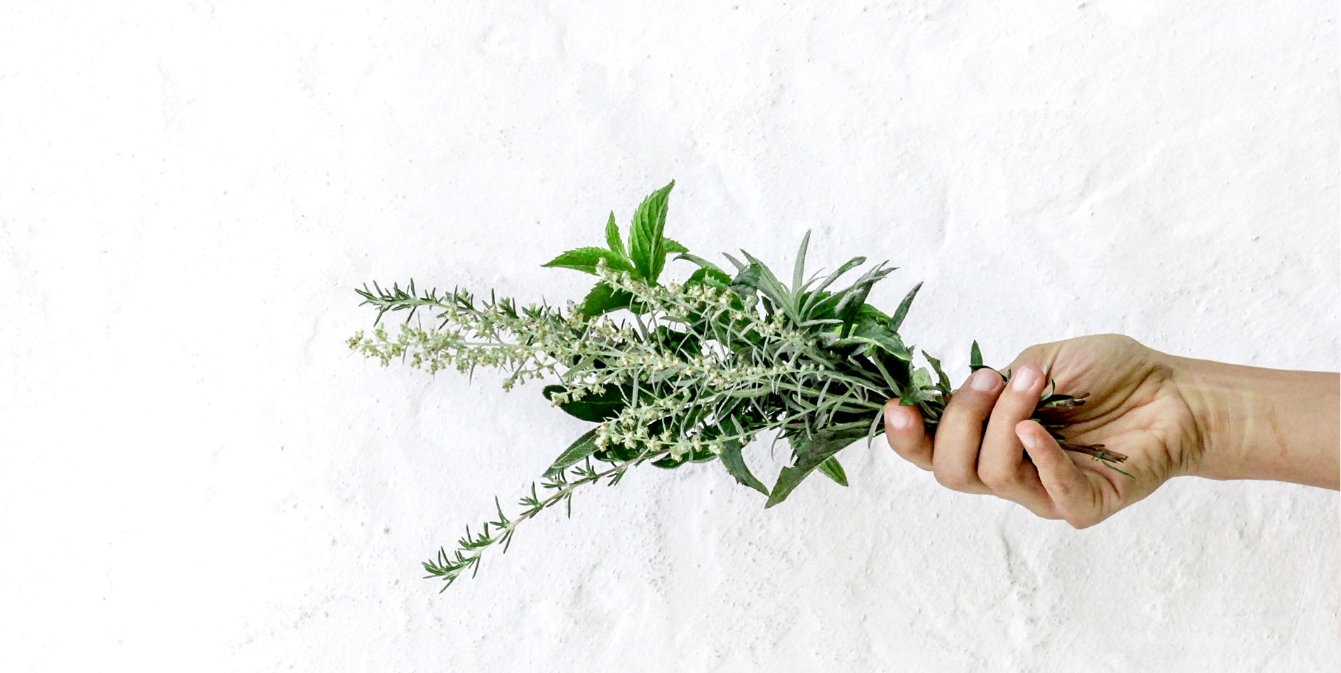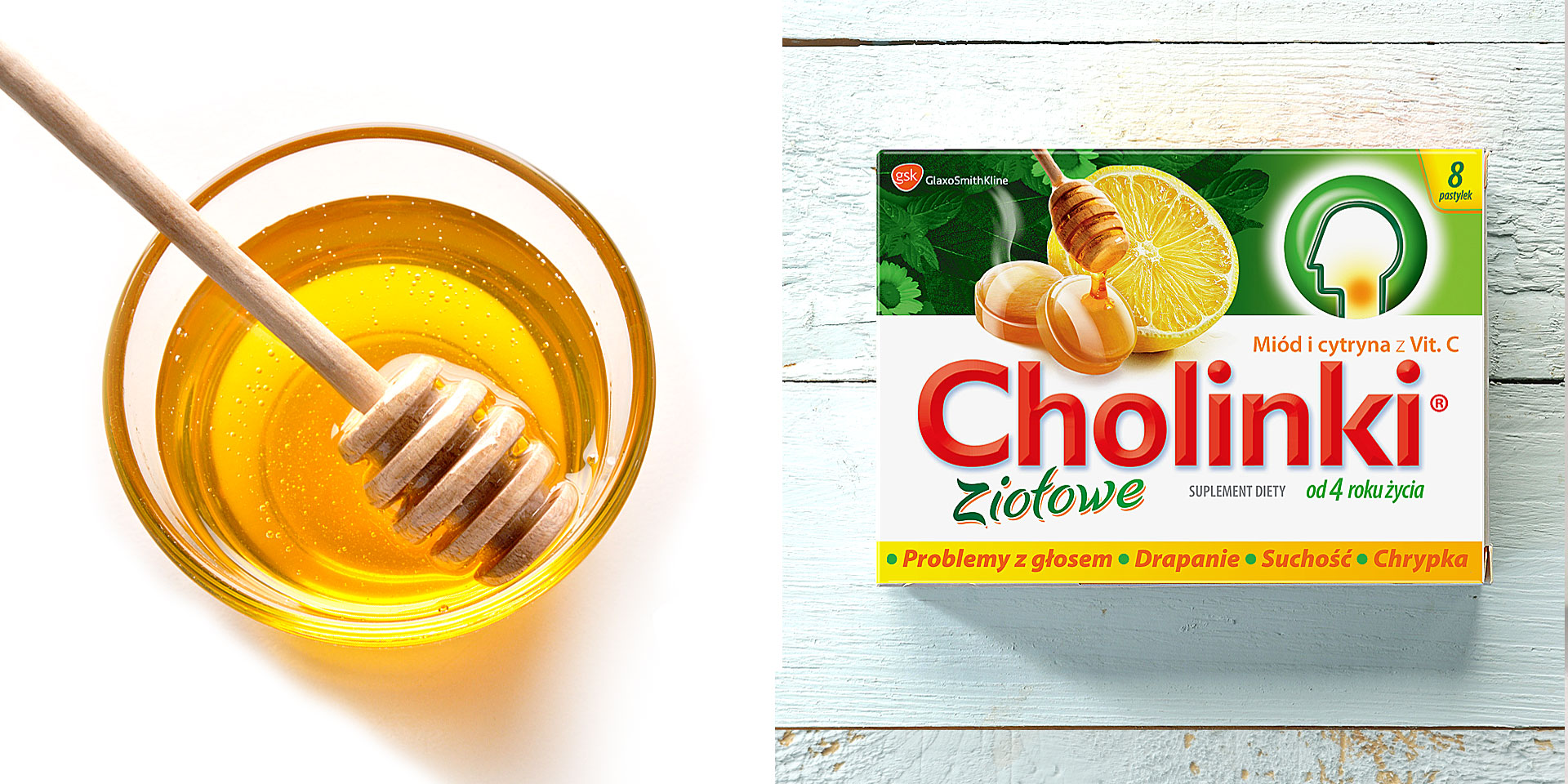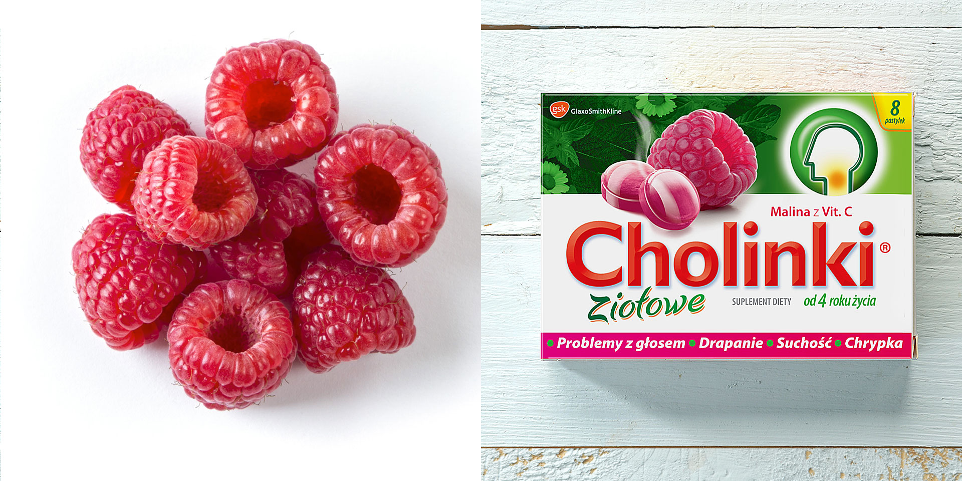
Cholinki is one of the brands derived from the development of Cholinex, well-known on the pharmaceutical market. The branding strategy of this brand family is coherent, which is why Cholinki is also used in its identification: a characteristic head icon with a marked place of operation, typography, and design arrangement. The distinguishing feature of the individual sub-ranges was the selected colour and additional elements defining the application (icons, product presentations). However, even within such a well-defined framework, there was still great potential for change for better communication of benefits and RTB. Our client wanted above all to modernize the Cholinki packaging, reveal its effectiveness, while communicating the herbal taste of the product.

Redesigning the brand made the packaging more professional and credible. Thanks to appropriate communication elements, the packaging looks modern, while maintaining a reference to the heritage of the mother brand, which largely impacts customer choice. The lifting goal was achieved thanks to the introduction of appetizing, natural and sophisticated visualizations of the ingredients responsible
for the taste of a given variant. The impact panel used in the project communicates the consumption of the supplement with specific ailments. The new line emphasizes the presence of herbs in the product in a non-intrusive, but credible and attractive manner. In addition, as part of the project, we created POS materials for the brand – displays that are compatible with the new Cholinki packaging. The whole piece looks modern, aesthetic and at the same time professional.

