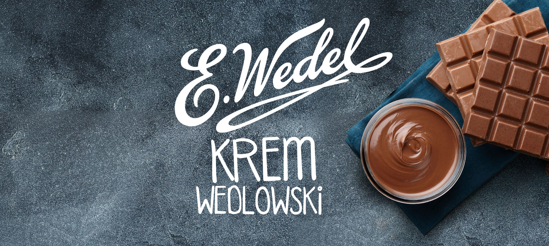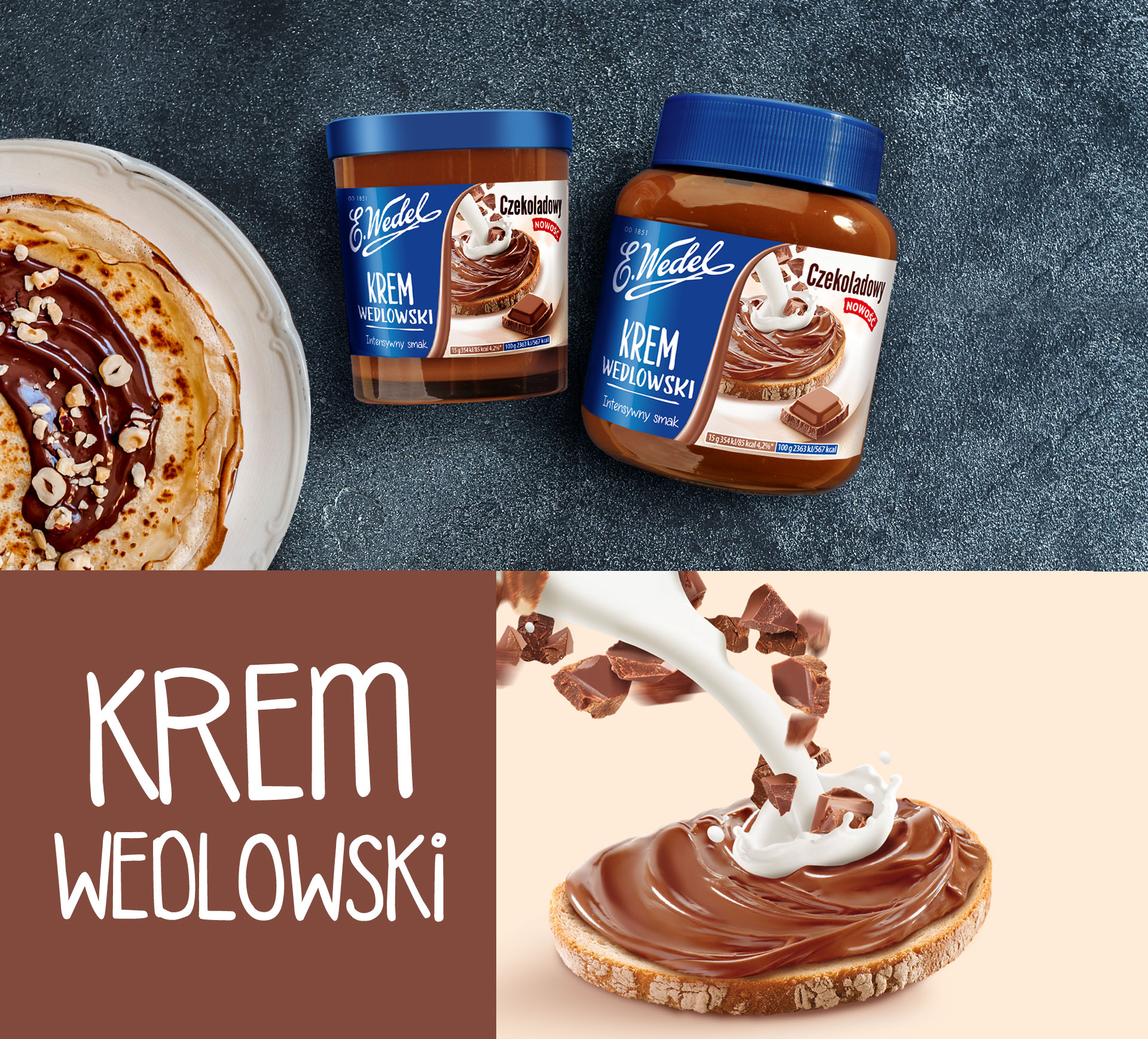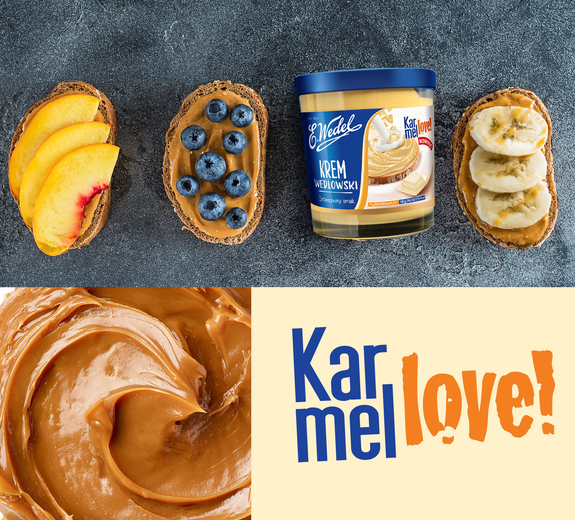
Wedel is one of the most recognizable Polish brands. An almost iconic brand for chocolate eaters from the Vistula. The basis of the Wedel offer are chocolates in tablets, and the chocolate itself is the brand’s distinctive feature. The brand is teeming with life and is still looking for new ways to expand its portfolio and reach the widest possible group of consumers. We help in this. As part of the consultation and creation, we supported him in introducing a new line of breakfast creams. We have created a packaging design for chocolate lovers in all forms.

Because „chocolate” is the Wedel brand’s main advantage over the competition, it is this value on packaging that has become our priority. We emphasized the intensity of the taste, referring to the clear symbolism of the vortex.
The new design of the Wedel Cream label has become the starting point for the preparation of Key Visual for the line and a comprehensive image campaign. Its effects were found on billboards, posters and POSM materials all over Poland.
