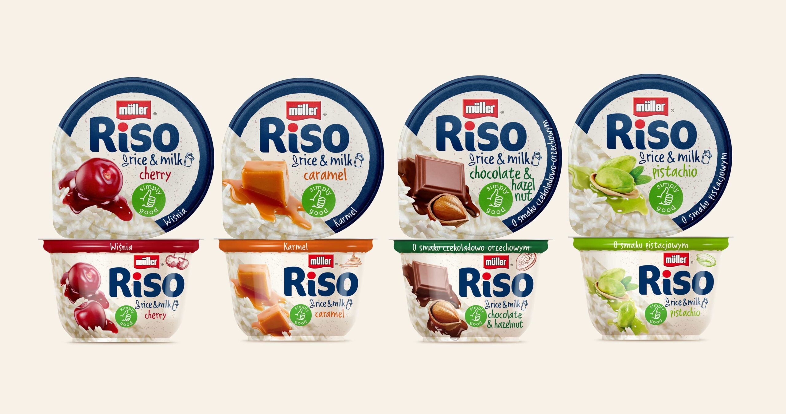
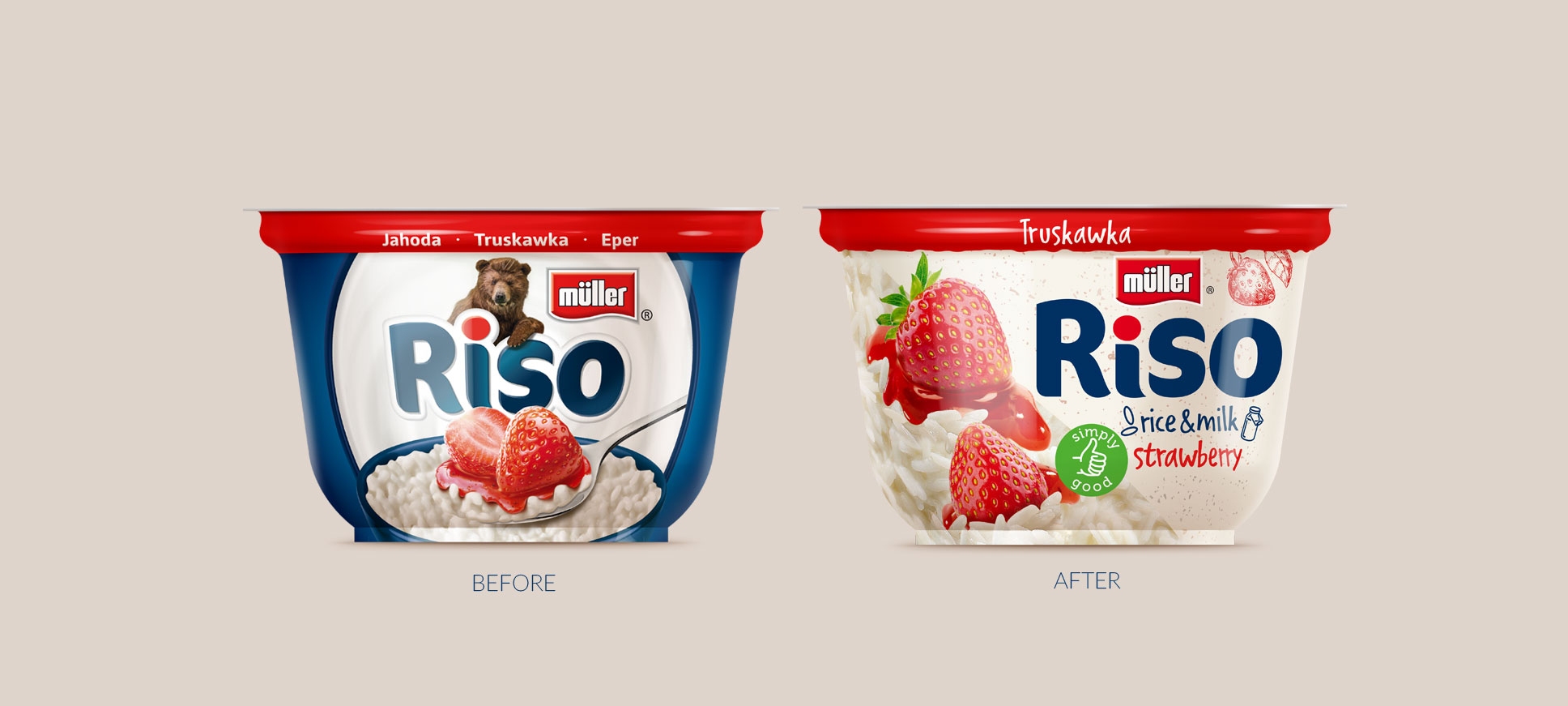
Müller RISO is an international brand of snacks based on rice and milk. It has a very strong position in the markets of Central and Eastern Europe. For many years, the brand has successfully developed, gaining and maintaining a leading position. The brand’s recognition was certainly influenced by strong communication support and creation based on the brand hero, also appearing in identification on packaging.
Facing changing consumer needs and market trends, the brand faced the need to redefine its image and positioning. How to stand out from the competition? How to strengthen brand perception and make its products the first choice at the shelf? The answer is to shift the focus from pleasure and a certain playfulness, toward developing an idea derived from consumer insight. This idea stems from the need to reach for a snack that is „good for me,” „healthier,” but still delicious and perfect for satisfying a small hunger. Our task was to convert this idea into Muller Riso’s branding and reflect it in the packaging designs.

Our work on the new visual identity primarily included a change in the logotype. We eliminated the bear illustration, which could have raised concerns about maintaining the recognizability and legibility of Muller Riso’s branding. Therefore, the new logotype retains the character of the previous identity, but is decidedly more contemporary
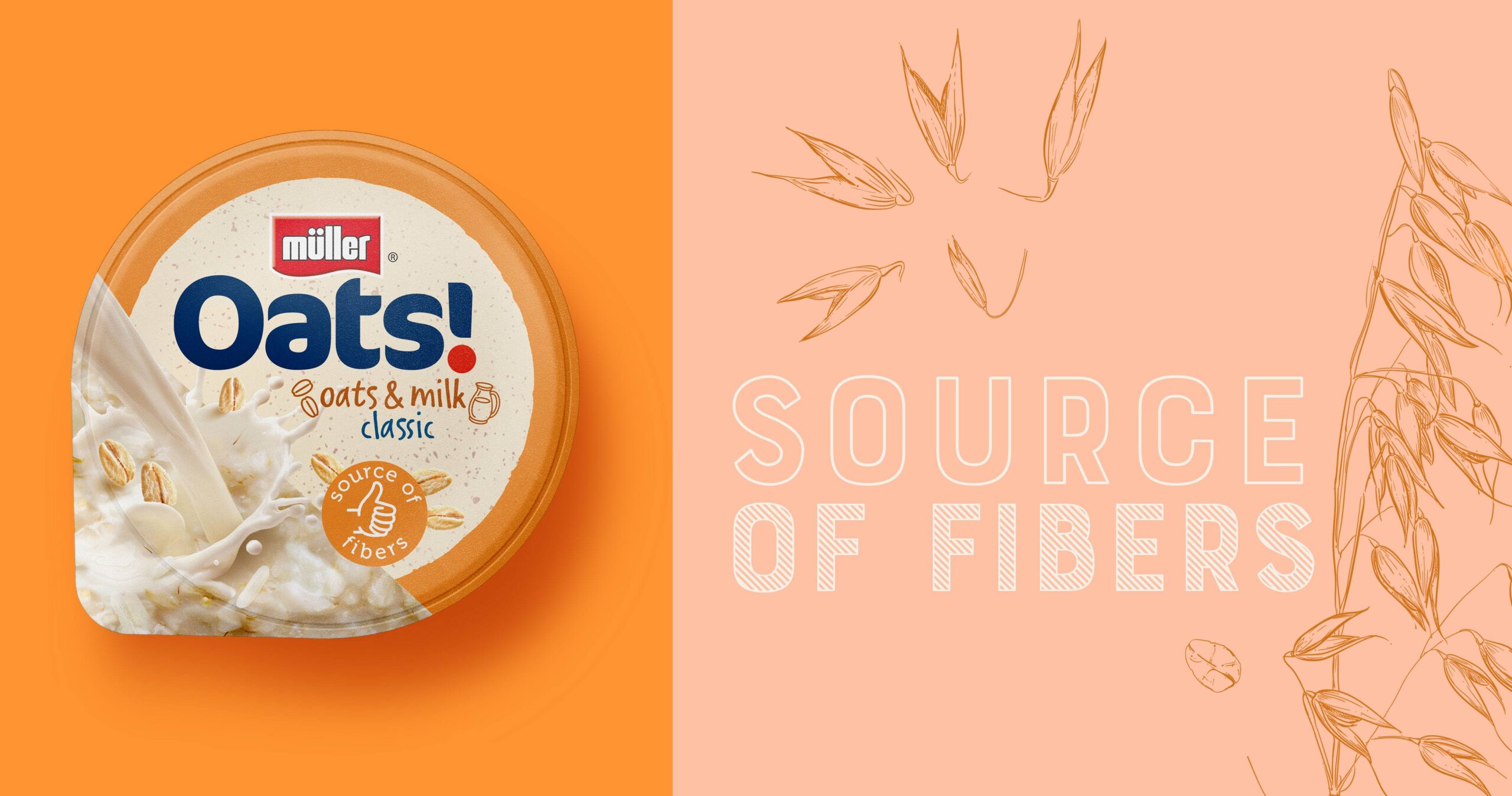
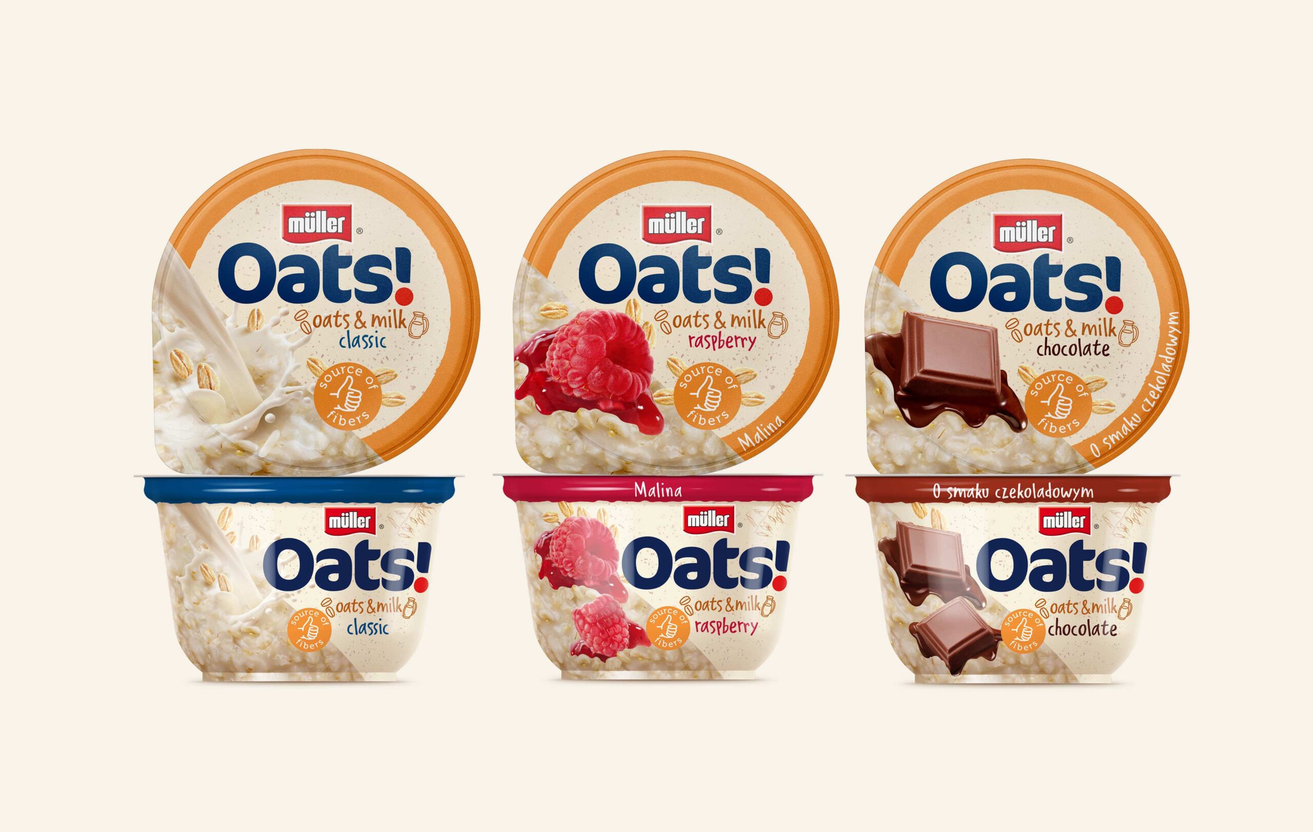
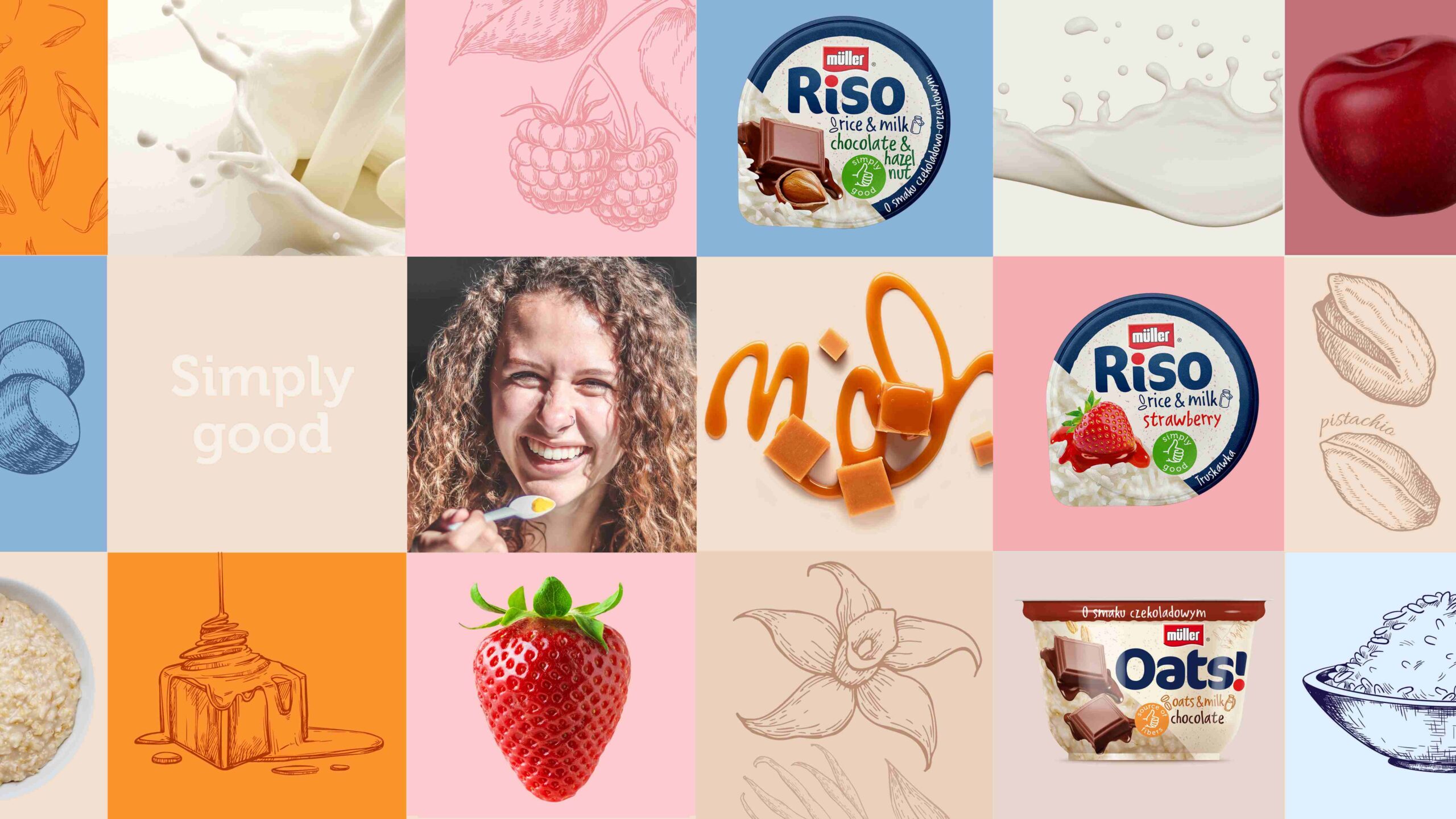
in expression. As a result, it provides the brand with the new identity opening it so clearly needed. The entire packaging has also changed. Each of the elements – illustrations, typography, colours and, above all, images of the product and flavour variants have been developed in such a way as to communicate as clearly as possible the concept of naturalness and nutritiousness resulting from the nature of the product. Also check out our project for Muller Fusion.