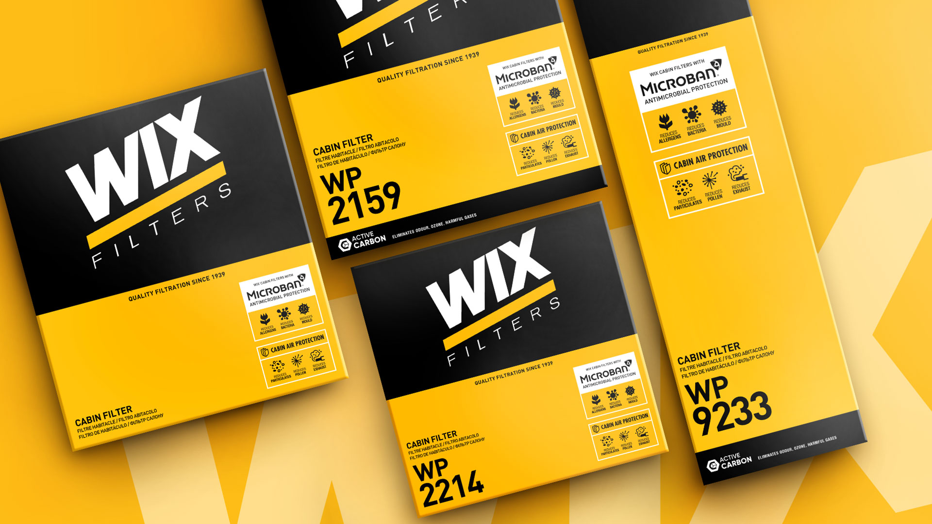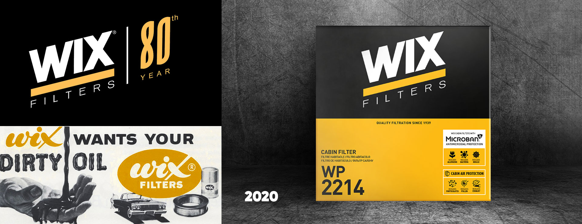
The American brand of filters for cars and heavy duty equipment is part of the multinational group Mann+Hummel. The brand has been operating for more than 80 years, successfully developing its competence in the European market. Among its product range, WIX Filters offers cabin filters that stand out from the competition and have special antibacterial protection. However, this important differentiator was not sufficiently communicated to users and potential customers. It became necessary to develop, as part of WIX branding, new graphic solutions.

Our task was to develop graphic solutions that communicate the basic properties of the cabin filter and its purpose in a literal and friendly way. At the same time it should be remembered that the branding, and to a large extent the design of the packaging, remained the same. We proposed a clear system of icons that emphasize the use of antimicrobial protection in the product and clearly explain what this protection consists in.
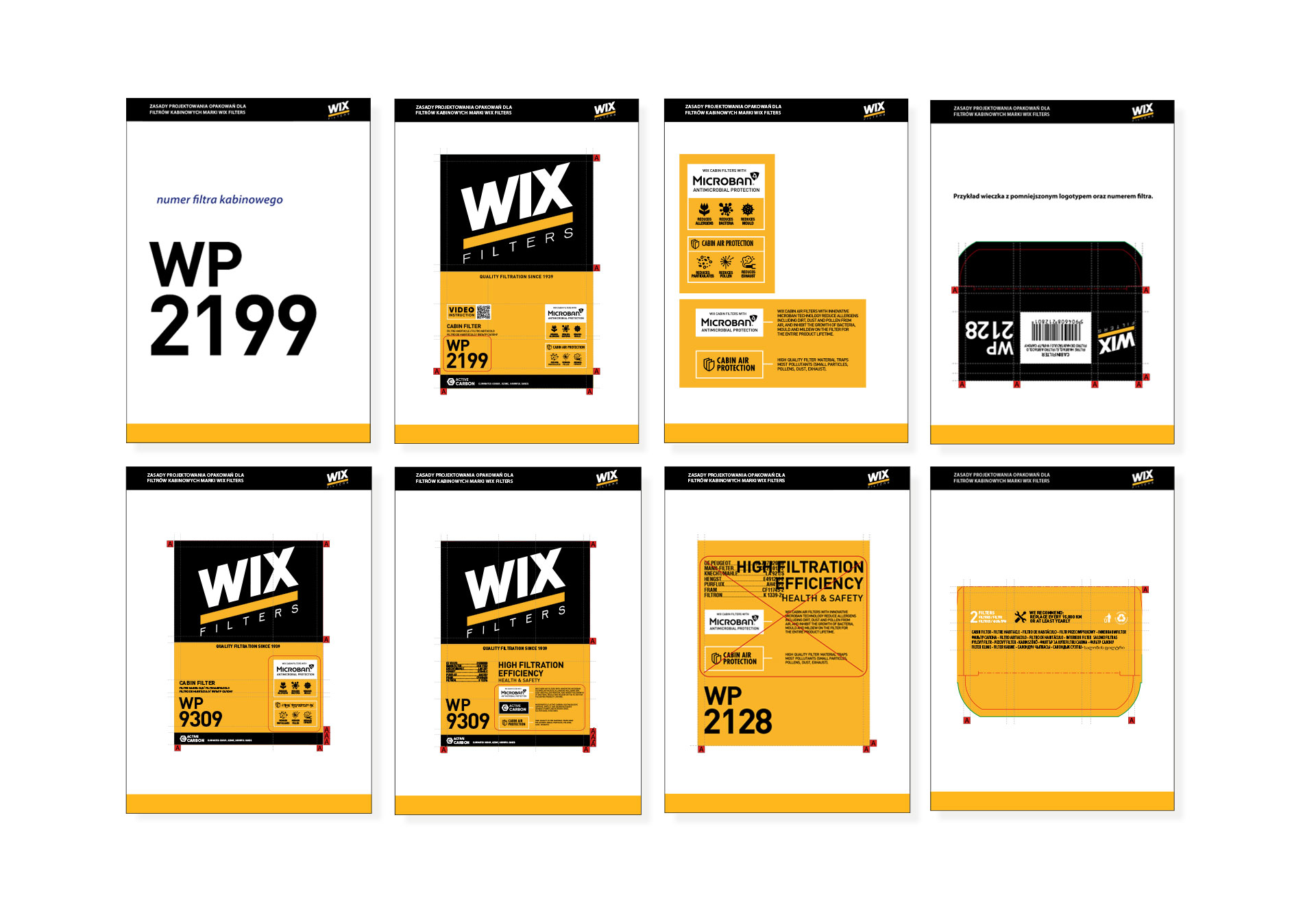
An important challenge of the project was to adapt the developed design to different sizes and formats of packaging, and to create a system that can be easily implemented on individual product SKUs. As part of our cooperation with the brand, we also provided full service in preparing files for printing.
In addition, the PND Futura agency carried out a project for nearly half a thousand packages of the FILTRON brand, in terms of implementing designs and preparing packaging for printing.


